 For this assignment we were asked to create a movie poster for a movie we would like to one day make, or were currently in the process of making. For my poster I chose to design one based off of a short animation I am making for another class. It is an animation about the realizations a man and woman come to after having getting into a fight. I chose to call it "Awakening" because it is a synonym of the word realization which is what I am trying to emphasize. Obviously I would never get either Cary Elwes or Sandra Bullock to be in the piece but the point of the assignment was not to be limited in our dreaming. We were to shoot for the stars.

Nov 30, 2008
Movie Poster
For this assignment we were asked to create a movie poster for a movie we would like to one day make, or were currently in the process of making. For my poster I chose to design one based off of a short animation I am making for another class. It is an animation about the realizations a man and woman come to after having getting into a fight. I chose to call it "Awakening" because it is a synonym of the word realization which is what I am trying to emphasize. Obviously I would never get either Cary Elwes or Sandra Bullock to be in the piece but the point of the assignment was not to be limited in our dreaming. We were to shoot for the stars.
Oct 27, 2008
DVD Menu Background
For this assignment, we were told to design a menu to be used on a DVD. We could design anything we wanted just as long as we followed the guidelines. I decided to use this opportunity to create a DVD menu intended to showcase my works as an animation student. I intend upon adding the different animations I have created to this DVD in order to make myself a demo reel to be used later when I apply for jobs. I feel that this assignment is a good opportunity for me to focus on my future and make something that I can show people and be proud of.

This is the finished work. Before I got to this point it was critiqued by everyone in my class. They all had suggestions for me that were mostly helpful. Mainly they told me I needed to fill the blank spaces with images of something. So after I got this input I decided upon two images to put in the blank spaces. You can see what they are by simply looking above.
Overall, I think that this menu turned out pretty well. I hope you like it.
Oct 8, 2008
Opening Credit Presentation
For this presentation we have to show how the images we see in the opening of a film, relate to design. We also have to talk about how the colors convey meanings as well as the font choice. I decided I was going to talk about 'Monsters, Inc.' because I love the movie and the introductory credits are very expressive.
Here is a link to the sequence on YouTube.
'Monsters, Inc.' Opening Credits
My presentation was actually this past Tuesday, which was October 7th. I guess you missed it. But you can still watch the video and get a little taste of what my presentation was like. I'll be back on later with more class updates.
Typography Assignment 1
This next assignment was one in where we had to take 8 phrases and use Photoshop to express them in our own way. The intent was to show how simple phrases could look many different ways when manipulated by a different individual.
This first phrase was simply; "AIDS: Apathy is Lethal." In order to make the word AIDS look the way it does I utilized a text fill in order to make an actual picture of the AIDS virus fill the word.
 For this next phrase; "Every Vote Counts," I chose to separate the words to show that each word has an individual importance. This ties in nicely with the actual meaning of the phrase because much like every vote counts, every word counts.
 For this last phrase; "Global War on Terror," I utilized different fonts in order to express the meanings of the different words. For 'Global' I chose to use impact because it is a very in your face and powerful font, while I chose to use the font entitled handwriting for 'War on Terror.' I decided to do this because war is gritty and raw, much like handwriting.
 Overall we had eight different phrases to put meaning to, this was only three, but I felt that these were the three best that I had to offer. See you next time for more assignments.
Training Exercise 1
One of the classes that relates to the design aspect of art is Computer Image Making. One of the assignments we were asked to complete was entitled replica. Our job was to find an advertisement that incorporated text and replicate it as best we could using Photoshop.
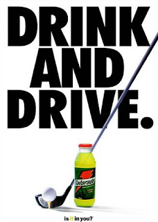
This first image was the original advertisement. It was then my job to replicate it.
This next image, the one below, was the final product. One of the ways we could have simplified our reconstruction of the ad was by taking pictures of the objects, if we had them, and Photoshop them into our work. However, since I did not own a set of clubs or have a Gatorade bottle on hand, I was forced to draw the objects by hand. I then used various tools such as the gradient tool and the pencil tool to modify the objects. I also rasterized the text and moved the letters closer toget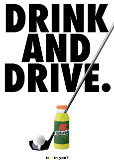 her so as to make my image more like the original.
Thanks for looking at my pieces. I will be back later and post more work that I have done.

This first image was the original advertisement. It was then my job to replicate it.
This next image, the one below, was the final product. One of the ways we could have simplified our reconstruction of the ad was by taking pictures of the objects, if we had them, and Photoshop them into our work. However, since I did not own a set of clubs or have a Gatorade bottle on hand, I was forced to draw the objects by hand. I then used various tools such as the gradient tool and the pencil tool to modify the objects. I also rasterized the text and moved the letters closer toget
 her so as to make my image more like the original.
Thanks for looking at my pieces. I will be back later and post more work that I have done.
Introduction
Hello, my name is Brian. I am a college student who is studying to become a computer animator. I have been in and out of art classes ever since I was in grade school. This means that I have been honing my talents on the computer as well as with traditional art mediums for many years. However, I have not yet reached my full potential as an artist and so I work tirelessly every day to become better at what I do.
Subscribe to:
Comments (Atom)